

CSS tips and tricks
A good user experience is made up of many things, and is made or broken by many different contributors. Part of the UX toolkit in my mind is providing teams the resources and pieces they need to contribute how they can to a good UX; a basic understanding of how to maintain the UI code base is pretty critical in making sure that little details (like link color) are handled consistently and easily across products.
With that, this is a second installment in basic CSS principles. CSS 102? I use these to help folks understand some basic concepts about how CSS works. This one is geared towards creating efficiencies and consistency in CSS for teams that are newer to front-end development, and helps them both decipher and create what they'll see in front-end components.
1. Zero is not a measurement
Any value that you have set to zero, it does not need a measurement. The semantically correct version is 0, not 0px.
p:first-child {padding: 3px 5px 0 1px;}
If you include the px, CSS people will obsessively take them out. We see it as two less characters to load over and over.
2. Use shorthand
Speaking of two less characters, always collapse your repeating values. It makes your code cleaner and easier to read, and saves way more than a couple characters.
The same principle works for hex colors: #000000 (black) can actually condense to #000.
3. Combine repeating properties
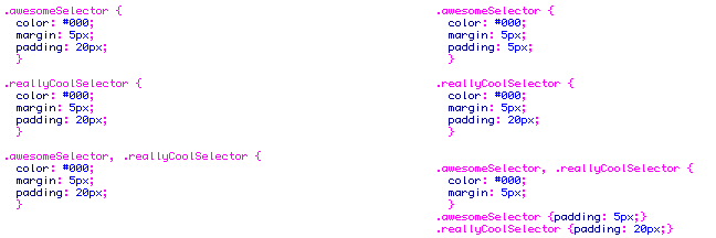
Commas are your friend; share properties between two rules by separating them with a comma, and save yourself some redundant code. The comma means that all the listed properties work for both selectors.
Take the first two classes in the example on the right. These two selectors can be combined into the third selector instead since they share the same attributes, then the unique attributes go to their own selectors.
If two selectors share only some of the same attributes, you can still merge your attributes where appropriate. In Example 2, the two classes to the right can have some attributes combined using comma selectors, while the unique attributes remain broken out. It may not seem like much, but if you do this enough, you save yourself a lot of redundant code, and shorten up the length of your document.
4. TRouBLe
The capital letters TRouBLe create a helpful convention to remember the order in which you declare your margins and padding, which is clockwise - Top, Right, Bottom, Left.
.fakeDiv {margin: 1px 2px 0 5px;}
(This gives you a top margin of 1px, a right margin of 2px, a bottom margin of 0, and a 5px margin on the left).
5. LoVe HAte
Yep, there's another. The caps this time indicate the order that your anchor pseudo-classes need to appear in your CSS. Link, Visited, Hover, Active, or a:link, a:visited, a:hover, a:active
6. Fonts are fun
There's a couple things to note when dealing with fonts. Properly declaring your font properties requires putting them in the proper order; incorrect ordering will cause the properties not to display.
The properties, in order, are:
font-style
font-variant
font-weight
font-size/line-height
font-family
It gives you a rule that looks something like this:
.fakeClass {font: oblique small-caps 700 1em/3em Georgia, Times, serif;}
7. One line vs. multi-line selectors?
The debate over CSS formatting is hotly contested, with two general schools of thought. Single-line fans prefer top scan their document and have all of the selectors line up for easy visibility.
Multi-line fans split all properties into individual lines, to make it easier to spot changes in the CSS, whether manually or through version control.
My style sheets use a combination of these, to walk a line between saving space and readability. By breaking out selectors with multiple properties into multi-line format, while condensing single properties to one line, you can still allow for high readability in version control, but saves sometimes hundreds of lines in the CSS without resorting to LESS.