

Learning CSS Basics
I've spent most of my career working with teams that are new to understanding user experience, building and educating teams from scratch. Before I can even codify a visual language and set of patterns, I need to get developers familiar with CSS, so there's more than just me maintaining a set of visuals, especially cross-product.
I usually start with a CSS 101, to help folks understand some basic concepts about how CSS works, and what they see when they open up a style sheet I've built.
With that, here's my primer:
1. CSS Building Blocks
CSS element are made up of four distinct pieces, each with a purpose.
Selectors: used to select the element you want to style
Properties: define which aspect of the selector will be styled
Value: the style rule that will be applied
Pseudo-classes: keyword defining a special state of the selector to apply the style to (a:link)
Pseudo-elements: keyword defining a special subsection of the selector to apply the style to (p:first-child)
Attribute: keyword that applies to certain selectors with attributes [lang|=fr]
selector[attribute]:pseudo-class {property: value;} or p[title]:first-child {padding: 3px 5px 0 1px;}
2. Use the right browser
IE is not for doing front-end work. Seriously. It violates basic rules of CSS that all the other main browsers follow. Whether you agree or disagree with the CSS standards, save yourself a lot of headache by working in a standards-compliant browser then adding in specific declarations to account for IE's bugs.
Yes, I understand that many users still use IE, especially in international or emerging markets. I'm not saying "don't style for IE" - I'm saying don't start there. If you do, you'll create an awesome page in IE then spend hours trying to make things display correctly everywhere else.
Some examples of IE's issues:
• Misunderstands auto margins
• Doesn't render float properties correctly
• Incorrectly setting element heights
• Doesn't get relative positioning with overflow
• Box model madness (see #3)
• Ignoring min-height
• Default padding on lists
With that said, use the right browser tools
Chrome is your friend, and you and dev tools are besties. But the main browsers all have a variant of the Inspect Element found in Chrome's dev toolkit (Firefox and Safari use Inspect Element, IE uses F12).
Right click on an element in your browser. A new window opens, and the left pane indicates which element you're reviewing within the code context - it's usually highlighted. The right pane displays all the styles (whether specified or inherited) that apply to a given element. Each CSS rule applied to the element displays in a block, and each one has the stylesheet name indicated along with the line the rule appears on. CSS rules being overridden are indicated by crossed out lines.
Inspect element shows temporarily editable code; meaning you can click on an HTML element, or click on a style, and temporarily change the value shown, until the page is refreshed. This is extremely helpful for troubleshooting your CSS.
3. Understand the box model
Each element on a page (paragraph, div, image, etc.) is contained in an invisible box, that give the element its width and height, padding, and border and margin factor to create the overall dimensions of the element.
For example, you have a 40px x 40px image, with 5px of padding. It has a 2px border, and a margin of 10px. Your root element has a size of 40x40, with a total size in all browsers (except IE) of 74px x 74px.
IE calculates the "box" differently than everyone else, combining padding and border into the original size of the element. Your root element in IE has a size of 54px x 54px, with a total size of 74px x 74px. No big deal, right? Same overall width; very different effect when you're dealing with things like percentages.
This has an impact when you have specific sizes for your containers, in order to control your display. Let's say you have a blog post, with text on one side, and an image on the other. Your image has a nice border with some padding and a margin.
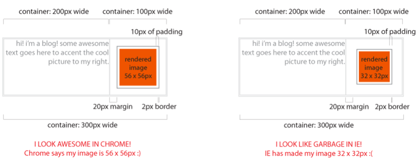
Chrome will calculate the total size of the base element containing your image correctly, keeping your image at 56x56. IE will factor in the size of the border and margin, reducing the size of your actual image to 32x32 (56px - 20px padding - 4px border). Pixelly grossness.
4. The "cascade" in Cascading Style Sheets (CSS)
To truly get how a particular property will work on an element, you need to understand how the style sheet applies Importance, Specificity, and Source Order. A style sheet uses these three things to determine a "weight" to assign to a CSS rule, which is what determines which of the styles associated with an element take precedence when there are multiple rules that apply.
Importance & source order
Styles can have multiple sources: the browser has a default style sheet, the user may have browser preferences set, and the web site the user is viewing may have a style sheet or sheets. In most cases, the browser displays these in this order of precedence, so the web site's style sheet will always win out over the browser or user settings.
Adding an !important declaration changes this a bit. !important wins out at any level, and becomes the rule of precedence. If !important is declared at both the site level and within the user's browser preferences, the user's preferences win.
Specificity
Each CSS rule has a "weight" assigned to it. The weighting determines which rule applies, as I said above. If two rules share the same weight, the one further down the style sheet applies. Calculating a rule's weight is something you may need to do to troubleshoot when first learning CSS, to understand why your style isn't displaying the way you'd expect. Over time, you don't have to do the maths.
But for those who like the maths, here's how it works:
• An element or pseudo-element gets 1 point
• An attribute, class, or pseudo-class gets 10 points
• An ID gets 100
• Inline styles get 1000
Understanding inheritance
An element inherits CSS rules from its parent by default. This is important - an element can inherit properties even though it may not specifically be identified in the style sheet. It's helpful for applying things like the same font size to body, instead of within each element on the page.
If you use developer tools in Chrome, you can see which properties an element inherits by right-clicking and going to Inspect Element. This will include both the specified styles for the element, and the styles an element inherits from its parent.
5. Reset your CSS
All browsers have defaults, for things like margins, lists, and so on. Some of these defaults are quite obvious (list indents), and some are more subtle (line heights). You would think that they all have the SAME defaults, but alas, they do not.
Enter the browser reset. Resets allow you to create a consistent default across all browsers, for any number of elements. Adding a simple bit of code at the top of your style sheet can save you hours of work trying to get things to line up cross-browser.
Most (if not all) of my style sheets use a modified Eric Meyer reset. This gives all browsers a consistent baseline across the most commonly used elements. It looks like the image to the right.
You can see the margins and padding are zeroed out on a ton of elements, along with creating a baseline font, with some HTML5 variances thrown in. What that means is if we add a 5px margin onto an element later on in the style sheet, the margin is truly 5px in every browser, instead of 5px in Chrome, and 7px in IE. Yee ha.
6. Block vs. inline elements
Block level elements are elements that cause a "break" in flow, pushing down items below them in the view order. Think of them as structural elements, having 100% width in their container. Block level elements respond to margins, width, height, and floats.
Block level elements include divs, paragraphs, forms, lists, and h1.
If you use any of these to create structure in your layout, you will not be able to run these next to another block level element without setting floats and widths.
Inline elements are items that flows with other items, and do not cause a break in layout. If an element is inline, it flows with text, and does not respond to top/bottom margins, padding, width and height.
Examples of inline elements include links and spans.Use a div when you want a structural element, like a column. Use a span when you have a text-based element, like adding emphasis to a section of a sentence.

7. Floats and clear
A float is an element that is shifted to the left or right on the current line. Floats cause a disruption in the normal page flow; for example, a paragraph can flow alongside an image (remember from #6 that paragraphs and div-wrapped images are block-level elements).

The example on the left in the style sheet would look like: .element {width: 100px; height 100px;}
To the right the styles would be: .element {width: 100px; height: 100px; float: left;}
Yet the HTML for them both is the same.
Clearing your float
The thing about floats is to remember they disrupt the natural flow order in your document - until you correct it. The float continues to be inherited until it's "cleared." With floats, the physical location of your element is important. Your float needs to be cleared in the styles of the element that directly follows your last floated element.
8. Margins vs. padding
Margins and paddings apply to different areas of your element. On the most basic level, padding applies to the INTERIOR of your element, while margins apply to the EXTERIOR of your element. This is most evident when you have a border on your element, but the same rules apply even if your element doesn't have a visible border.
Padding adds to the total width and height of your base element, whereas margins do not. For example, if you have an image that's 20px x 20px with 5px of padding, your base element increases to 25px x 25px.

9. Ems vs. Pixels vs. Points vs. Percents
Ems: An em is a scalable unit, used in both print and screen media. An em in print terms equates to the square area a capital M takes in your current font at your current size.
On the web it's kind of the same thing. Think of it like each character having a box around it; the height of the box is equal to the capital letters in your font. It's used to create relative size relationships to create scalable elements. More on that below.
Pixels & Points: Fixed-size unit that does not scale. Pixels (px) are screen media measurements; one pixel is equal to one dot on your screen. Points (pt) are typically used in print media, and a point is equal to 1/72 of an inch (72pt. type is 1 inch tall)
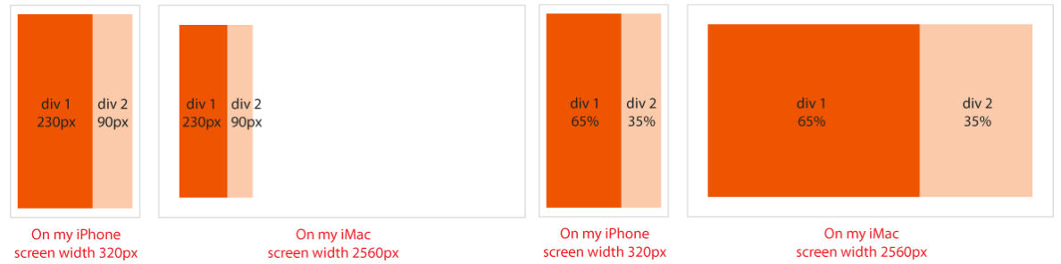
Using a combination of percentages and ems to create a scalable, responsive UI works both on a giant monitor, and a small iPhone. You can use percents for widths on "core" elements, like layout blocks. Ems are used for object heights containing fonts (like our blue nav bar), to keep the heights proportional to the fonts they contain.
Percent: Percent is a scalable unit like ems. It's used in conjunction with ems to create scalable, readable fonts on the web, and it's used to maintain relative size relationships that scale no matter what device or screen you are on.
I use a combination of percentages and ems to create a scalable, responsive UI that works both on a giant monitor, and a small iPhone. Using percents for widths on "core" elements, like the blocks on the home page, and ems for object heights containing fonts (like a nav bar), it keeps the heights proportional to the fonts they contain, and helps your layout's major blocks scale appropriately.
10. Class vs. ID
At a basic level, classes can be used several times on a page, while IDs are supposed to be unique and referenced only once on a page. Technically, using the same ID repeatedly won't break your page. But your page will fail specification validation if there are repeating IDs.
Use IDs for foundation-type elements, like page wrappers or navigation bars. Use classes for repeating elements, like styles applied to links and paragraphs. You can apply both an ID and classes to an element, to give it uniqueness along with applying common styles. This is used frequently within style sheets, since they use IDs for distinct JavaScript events, and reserve classes for the application of global styles.